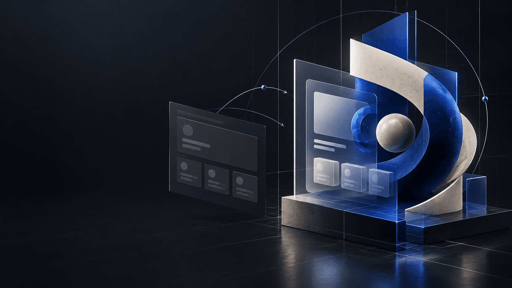
The product can be solid and still look cheap
There is a specific kind of late-night build where the product works, the API responds, the database is behaving, and then you open the homepage and think: “Why does this look exactly like every other SaaS product?”
That is not always a code problem. Usually, it is a direction problem.
AI coding agents are very good at producing a competent interface from a vague request. Give one the words “modern SaaS landing page” and it will usually give you a navigation bar, a hero, a few rounded cards, and a gradient that has seen things. The result may be technically fine while still feeling anonymous.
The workflow in this post is how I think about fixing that. Start with a dependable technical foundation, answer a short creative brief, and then give the agent a prompt that describes a point of view—not just a list of components.
First, give the project a real foundation
The first prompt is intentionally boring. That is a compliment.
Before asking for art direction, I want the project to have a predictable Next.js App Router structure, strict TypeScript, Tailwind, and an isolated place for browser-only 3D code. The initial scene can be a simple rotating object. Its job is not to win an award. Its job is to prove that the canvas, camera, lighting, and client boundary are wired correctly.
If you are starting from scratch, use this prompt:
Copyable prompt
Prompt 1 — Start a new project
Show full prompt
Set up a new Next.js project for a premium interactive 3D website.

Use:
- Next.js with App Router
- TypeScript
- Tailwind CSS
- Three.js
- React Three Fiber
- Drei
- GSAP + ScrollTrigger
- Motion
- Lenis
- Zustand
- React Three Postprocessing

Create a clean project structure for normal UI components, page sections, Three.js scenes, models, effects, hooks, and state.

Set up a basic React Three Fiber canvas with a simple rotating object to confirm Three.js works.

Configure GSAP, Motion, and Lenis correctly for Next.js, but do not build any real animations or website design yet.

Make sure everything is compatible, run lint/build checks, fix any errors, and leave the project ready for us to start designing the website.
There are two details here that save time later:
- The prompt says where the Three.js code belongs. That keeps WebGL out of server components and makes it easier to lazy-load.
- It asks for lint and build checks before design work begins. A pretty hero is not much use if the production build is already unhappy.
Adding the foundation to an existing project
If the website already exists, the request should be narrower. Tell the agent to add the 3D foundation without redesigning the rest of the site. This is a useful boundary because “add Three.js” and “rebuild my entire homepage” are very different jobs.
Copyable prompt
Prompt 2 — Add 3D to an existing project
Show full prompt
Add a modern 3D/WebGL setup to this existing project.

Install and configure:
- three
- @react-three/fiber
- @react-three/drei
- @react-three/postprocessing
- postprocessing
- gsap
- @gsap/react
- lenis

Create a clean Three.js structure for scenes, models, lights, effects, and reusable canvas components.

Add a simple React Three Fiber test scene with:
- one 3D object
- basic lighting
- camera setup
- temporary OrbitControls
- subtle animation

Make sure it works correctly with Next.js App Router and avoids SSR or hydration issues.

Do not redesign the existing website. Only add the 3D foundation and verify the project builds successfully.
I would keep the temporary OrbitControls scene behind a development-only route or component once the real experience is ready. It is a good diagnostic tool, but it should not quietly become the interaction model for the finished homepage.
Answer six questions before writing the giant prompt
The long prompt is not magic. It is just a place to put decisions that would otherwise be made randomly by the model.
Answer these six questions first:
- What is the brand or project name, and what does it do?
- Who is the target audience?
- What visual style do you want?
- What are the main brand colors?
- What should the main 3D centerpiece be?
- What sections belong on the homepage?
The fifth question does not have to be “a floating neural network.” In fact, please give that idea a rest unless the product genuinely depends on it. A digital sculpture, a transformed material, a navigable room, or one strange but understandable object will usually create a stronger identity than a cloud of connected dots.
For my own direction, I like to specify the first reaction I want: calm, curious, precise, playful, cinematic, or something else. That single line helps an agent choose between a quiet editorial composition and a maximal WebGL demo.
Prompt 3: build the premium interactive homepage
Once the project foundation and creative answers are ready, I use a fuller prompt. The version below is deliberately hidden behind a disclosure so it does not turn the article into a scroll marathon. The copy button still copies the complete prompt—not the shortened visible summary.
Copyable prompt
Prompt 3 — Build the premium interactive homepage
Show full prompt
You are going to build and fully implement a premium, highly interactive 3D homepage based on the USER INFORMATION provided below.

IMPORTANT:

The information supplied by the user is the creative source of truth.

Do NOT simply insert the user's brand name into a pre-existing concept.

Before building anything, reinterpret this entire prompt around the user's:

- brand
- industry
- idea
- visual style
- audience
- colors
- 3D concept
- desired feeling
- content
- sections
- references
- imagery
- interactions

Every example later in this prompt is only inspiration.

If an example conflicts with the user's concept, replace it.

If the user's concept requires a completely different 3D object, visual language, image direction, section structure, motion system, or interaction style, change it.

Remove irrelevant ideas.

Invent missing details intelligently.

Do not ask unnecessary questions once enough information has been provided.

The final result must feel specifically designed for THIS brand.

---

## USER INFORMATION

Brand / project name:

[BRAND NAME]

What does the brand, company, product, creator, studio or project do?

[DESCRIPTION]

Industry / type of website:

[INDUSTRY]

Target audience:

[TARGET AUDIENCE]

Desired visual style:

[VISUAL STYLE]

Examples:

Japanese minimalism + cinematic
Luxury fashion + surreal editorial
Futuristic automotive + industrial
Dark fantasy + cinematic gaming
Brutalist architecture + experimental
Premium technology + minimal
Organic nature + soft luxury

Desired feeling:

[3-6 WORDS]

Examples:

premium, mysterious, calm, futuristic, aggressive, elegant, playful, surreal

Main colors:

[COLORS]

Main hero headline:

[HERO HEADLINE]

Supporting hero text:

[HERO SUPPORTING TEXT]

Main 3D centerpiece idea:

[3D OBJECT / ENVIRONMENT / CONCEPT]

Examples:

abstract temple
mechanical artifact
futuristic vehicle sculpture
floating perfume bottle
architectural structure
organic glass flower
planetary machine
luxury product
fantasy monument
abstract logo sculpture

3D material direction:

[MATERIALS]

Examples:

chrome + smoked glass
black lacquer + red glass
brushed aluminium + carbon fibre
stone + gold
ceramic + translucent resin

How should the 3D centerpiece transform through the page?

[TRANSFORMATION IDEA]

Examples:

explode into components
unfold
reconstruct
change material
reveal internal structure
become wireframe
fragment
morph
open mechanically

Homepage sections:

[SECTIONS]

Example:

Hero / About / Services / Projects / Technology / Contact

Image direction:

[IMAGE DIRECTION]

Examples:

cinematic sci-fi concept art
luxury fashion photography
Japanese architectural photography
surreal landscapes
high-end automotive campaign imagery
abstract material studies

Special interactions/effects wanted:

[EFFECTS]

Things that should NOT appear:

[THINGS TO AVOID]

Optional visual references:

[REFERENCES]

Desired first reaction:

"[WHAT SHOULD SOMEONE THINK OR FEEL WITHIN 5 SECONDS?]"

---

## ADAPTATION RULE

Before implementation, interpret the USER INFORMATION and internally establish a complete creative direction.

Rewrite and adapt ALL subsequent decisions according to that direction.

For example:

If the user chooses a luxury fashion brand:

do not retain sci-fi machinery, gaming interfaces or technical HUD language.

Instead adapt the experience toward:

- fashion editorial typography
- fabric / glass / metal sculpture
- campaign imagery
- elegant motion
- restrained interactions

If the user chooses an architecture studio:

adapt toward:

- spatial composition
- structural geometry
- architectural materials
- buildings
- plans
- environmental imagery
- camera movement through space

If the user chooses a gaming studio:

adapt toward:

- worldbuilding
- environments
- game imagery
- cinematic 3D
- interactive artifacts
- atmospheric effects

If the user chooses an automotive brand:

adapt toward:

- engineering
- speed
- mechanical detail
- premium product presentation
- carbon fibre
- metallic surfaces
- aerodynamic movement

If the user chooses Japanese minimalism:

adapt typography, spacing, materials, imagery and motion accordingly.

DO NOT retain unrelated visual concepts simply because they appear as examples later.

The generated website should feel as if an elite creative agency developed a completely original identity specifically for the supplied project.

---

1. PRIMARY GOAL

---

Create a homepage that feels like a high-budget interactive digital experience.

It should not feel like:

- a website template
- a generic SaaS landing page
- a generic portfolio
- a component-library demo
- a basic Three.js experiment
- an AI-generated template

The premium feeling should come from:

- composition
- typography
- 3D art direction
- original imagery
- lighting
- materials
- camera direction
- WebGL
- motion
- interaction
- spacing
- restraint

Do not create a normal website and then decorate it with random Three.js elements.

The entire page should feel like one coherent creative world.

---

1. BRAND INTERPRETATION

---

Use the supplied:

[BRAND NAME]

[DESCRIPTION]

[INDUSTRY]

[TARGET AUDIENCE]

to determine:

- tone
- copy
- visual hierarchy
- section naming
- imagery
- typography
- interaction intensity
- motion personality
- 3D language

Do not force generic headings such as:

"Features"
"Solutions"
"Why us"

unless they actually suit the project.

Use terminology appropriate to the user's industry.

---

1. CREATIVE DIRECTION

---

Primary direction:

[VISUAL STYLE]

Desired emotional qualities:

[DESIRED FEELING]

Translate this into a consistent system covering:

- layout
- grid
- typography
- color
- image direction
- material choices
- lighting
- motion
- camera
- 3D geometry
- interaction

If the user has supplied visual references, analyze their qualities conceptually.

Do not directly copy another brand.

Create an original interpretation.

---

1. THINGS TO AVOID

---

Explicitly avoid:

[THINGS TO AVOID]

Also avoid generic premium-design clichés unless they genuinely fit the project:

- excessive purple gradients
- glowing cards everywhere
- random glassmorphism
- excessive rounded containers
- random floating spheres
- excessive bloom
- meaningless technical labels
- unnecessary particles
- effects with no conceptual purpose

Use restraint.

---

1. COLOR SYSTEM

---

Base the visual system around:

[COLORS]

Determine appropriate:

- primary background
- secondary background
- primary text
- secondary text
- accent
- secondary accent
- 3D material colors
- generated-image palette

If exact HEX codes are not supplied, choose sophisticated values yourself.

Do not simply use default CSS colors.

Use accent colors strategically rather than everywhere.

---

1. TYPOGRAPHY

---

Typography must be treated as part of the visual artwork.

Use the supplied hero headline:

[HERO HEADLINE]

Supporting line:

[HERO SUPPORTING TEXT]

Create contrast between:

- huge display typography
- editorial headlines
- supporting text
- body copy
- metadata
- micro-typography

Depending on the user's visual direction, typography may:

- overlap the 3D object
- move behind geometry
- sit partially outside the viewport
- use vertical orientation
- reveal through masks
- interact with imagery
- change scale while scrolling
- become part of the spatial composition

Do not force these effects if they conflict with readability or the chosen style.

Choose typography appropriate to the brand.

Do not automatically use a generic futuristic font.

---

1. MAIN 3D CENTERPIECE

---

Base the main Three.js centerpiece on:

[3D OBJECT / ENVIRONMENT / CONCEPT]

This object or environment must feel designed specifically for the supplied brand.

Do not default to:

- sphere
- cube
- torus
- torus knot
- random blob
- generic floating geometry

unless one of those is genuinely appropriate to the concept.

Interpret the user's idea creatively.

The centerpiece may be:

- an object
- architectural structure
- abstract sculpture
- machine
- product
- environment
- monument
- logo-based sculpture
- organic structure
- hybrid system

Prioritize a strong silhouette.

It should look impressive even as a still image.

---

1. PROCEDURAL THREE.JS

---

Do not use Meshy or any external AI 3D-generation service.

Do not depend on externally generated 3D models.

Create the primary 3D centerpiece procedurally using Three.js / React Three Fiber wherever practical.

Possible tools include:

- BoxGeometry
- CylinderGeometry
- PlaneGeometry
- SphereGeometry where justified
- BufferGeometry
- ExtrudeGeometry
- TubeGeometry
- LatheGeometry
- curves
- splines
- instancing
- merged geometry
- custom shaders

Do not leave obvious primitive geometry untreated.

Refine geometry through:

- beveling
- tapering
- layering
- custom curves
- negative space
- asymmetry
- varying thickness
- intersections
- recesses
- structural gaps
- controlled imperfection

The final result should feel intentionally modeled.

---

1. 3D STRUCTURE

---

Translate:

[3D OBJECT / ENVIRONMENT / CONCEPT]

into a multi-layered structure.

Determine appropriate components.

For example, the object may require:

- primary body
- internal core
- frame
- structural supports
- outer shell
- floating pieces
- secondary geometry
- details
- accent components
- moving components

Do NOT mechanically use all of these.

Create whatever architecture best fits the user's object.

Use hierarchy.

Large forms establish the silhouette.

Medium forms create character.

Small details provide scale.

Avoid excessive micro-detail.

---

1. MATERIAL SYSTEM

---

Base the materials around:

[MATERIALS]

Translate them into believable Three.js materials.

Consider:

- roughness
- metalness
- transmission
- IOR
- thickness
- clearcoat
- opacity
- reflectivity
- normal detail
- surface imperfections

Materials must not look like default Three.js examples.

The material system should reinforce the brand.

---

1. CODEX IMAGE GEN FOR MATERIALS

---

Use the installed Image Gen skill when original image-based material assets would improve the 3D result.

Possible uses:

- surface textures
- roughness references
- material imperfections
- decals
- atmospheric overlays
- graphic patterns
- environmental textures

Only generate assets that genuinely improve visual quality.

Do not create noise simply to make the project seem complicated.

---

1. LIGHTING

---

Determine lighting from the user's visual style.

Possible directions include:

- cinematic
- luxury product photography
- gallery lighting
- natural daylight
- dramatic side light
- atmospheric darkness
- high-fashion studio
- industrial
- warm architectural
- surreal

Build a controlled system using appropriate combinations of:

- key light
- fill light
- rim light
- environment light
- area lights
- emissive details
- shadows

Do not illuminate everything equally.

Lighting should reveal form.

---

1. CAMERA ART DIRECTION

---

Treat the Three.js camera like a real camera.

Do not simply place it centered in front of the model.

Choose framing according to the concept.

Potential approaches:

- low angle
- close crop
- off-center
- extreme negative space
- monumental perspective
- macro view
- architectural view
- product view
- wide environmental framing

Use the camera as part of the storytelling.

---

1. CAMERA STORY

---

Throughout scrolling, evolve the camera.

The exact sequence should be determined by:

[SECTIONS]

and:

[TRANSFORMATION IDEA]

Possible progression:

Hero:
establish the centerpiece.

Next section:
approach it.

Middle section:
discover another side.

Transformation:
move closer to internal geometry.

Projects/content:
allow imagery to dominate.

Ending:
resolve to a final composition.

Do not constantly orbit the object.

Camera movement should feel intentional.

---

1. 3D MOTION

---

Determine the movement personality from:

[DESIRED FEELING]

For example:

luxury:
slow, weighted, restrained.

gaming:
cinematic, atmospheric, mechanical.

fashion:
fluid, elegant, unusual.

automotive:
precise, engineered, energetic.

organic:
soft, breathing, natural.

Potential motion:

- floating
- subtle rotation
- breathing
- mechanical articulation
- individual component movement
- deformation
- material animation

Do not animate simply because something can move.

---

1. POINTER INTERACTION

---

Use pointer input selectively.

Possible reactions:

- camera parallax
- slight object orientation
- light movement
- shader distortion
- reflection changes
- component movement

Keep interaction appropriate to the brand.

Premium interaction is usually subtle.

Do not make everything chase the cursor.

---

1. HERO

---

Create a highly memorable opening viewport using:

[HERO HEADLINE]

[HERO SUPPORTING TEXT]

and:

[3D OBJECT / ENVIRONMENT / CONCEPT]

Compose typography, 3D and negative space as one scene.

Do not put the 3D artwork inside a generic card.

The centerpiece should feel integrated into the page.

Add small supporting labels only if they fit the brand.

Do not invent fake technical labels for brands where technical UI would be inappropriate.

---

1. HERO ENTRANCE

---

Create a cinematic entrance appropriate to:

[VISUAL STYLE]

Potential sequence:

1. atmosphere/background appears
2. small supporting elements emerge
3. hero typography reveals
4. 3D centerpiece becomes visible
5. lighting settles
6. supporting line appears
7. interaction hint appears

Use staggered timing.

Avoid generic bounce animations.

---

1. CODEX IMAGE GEN

---

Actively use the installed Image Gen skill whenever original artwork would significantly improve the website.

Do not use generic online placeholders.

Generate original visual assets specifically for:

[BRAND NAME]

Save assets into logical project folders.

Example structure:

public/
images/
hero/
projects/
textures/
environments/
effects/

Use descriptive filenames.

---

1. IMAGE ART DIRECTION

---

Base generated imagery on:

[IMAGE DIRECTION]

and:

[VISUAL STYLE]

Every generated image must have a defined purpose before generation.

Determine:

- aspect ratio
- subject
- focal point
- negative space
- lighting direction
- palette
- depth
- cropping
- expected interaction

Do not generate generic wallpapers.

Generate assets designed for the actual layout.

---

1. IMAGE CONSISTENCY

---

All generated imagery must feel like it belongs to the same brand.

Maintain consistency in:

- lighting philosophy
- visual sophistication
- color treatment
- contrast
- realism/stylization
- composition

Individual images may vary while remaining part of one art direction.

---

1. IMAGE GEN ADAPTATION

---

Generate imagery appropriate to the user's industry.

Examples:

Gaming:
cinematic worlds, environments, key art.

Fashion:
campaign photography, surreal editorial imagery, fabric studies.

Automotive:
cinematic vehicle imagery, materials, engineering close-ups.

Architecture:
buildings, spatial studies, atmospheric environments.

Technology:
abstract systems, product imagery, material studies.

Luxury:
high-end product photography, restrained environments.

Do not retain game-world imagery if the supplied project is not a game studio.

---

1. WEBGL IMAGE INTEGRATION

---

Do not automatically treat generated imagery as ordinary rectangular images.

For major visual sections, consider WebGL planes.

Possible treatments:

- perspective
- parallax
- distortion
- displacement
- refraction
- masks
- depth
- transitions
- cursor response

Use normal DOM images where WebGL would add unnecessary complexity.

Choose the medium intentionally.

---

1. PREMIUM IMAGE HOVER

---

If images are interactive, make the interaction match:

[EFFECTS]

Potential effects include:

- slight perspective shift
- cursor parallax
- UV displacement
- mask reveal
- refractive distortion
- depth simulation
- layered movement
- subtle chromatic separation
- image transformation

Do not wildly distort imagery unless the style calls for it.

A still frame must remain beautiful.

---

1. 2.5D IMAGE DEPTH

---

Where useful, make generated imagery feel spatial.

Potential methods:

- foreground / middle / background layers
- displacement maps
- depth shaders
- independent parallax
- perspective movement
- atmospheric layers

Use Image Gen to create supporting layers only when necessary.

---

1. SUPPORTING IMAGE ASSETS

---

Image Gen may create:

- masks
- overlays
- fog
- foreground elements
- environmental textures
- decals
- abstract patterns
- depth references
- background atmospheres

Do not generate dozens of files without purpose.

---

1. IMAGE TRANSITIONS

---

Create transitions that match the brand.

Potential techniques:

- distortion
- masks
- directional wipes
- depth movement
- scale
- material-like refraction
- shader transition
- layered reveal

Avoid using the exact same transition everywhere.

---

1. NO VIDEO

---

Do NOT generate video.

Do NOT depend on video.

Do NOT leave video placeholders.

Create cinematic movement using:

- procedural Three.js
- generated images
- WebGL
- shaders
- parallax
- particles
- camera movement
- lighting
- GSAP

If the concept might normally use video, create an interactive real-time equivalent.

---

1. PAGE SECTIONS

---

Build the homepage around:

[SECTIONS]

Interpret those sections based on the user's industry.

Do not blindly create:

Studio
Capabilities
Worlds
Technology

unless those sections make sense.

Rename and redesign sections.

For example:

Fashion:
Collection / Campaign / Atelier / Archive

Automotive:
Design / Performance / Engineering / Models

Architecture:
Practice / Projects / Approach / Studio

Gaming:
Studio / Worlds / Technology / Careers

SaaS:
Product / Workflow / Use Cases / Results

Make the structure belong to the brand.

---

1. ABOUT / MANIFESTO

---

If appropriate, create an editorial section explaining the brand philosophy.

Use concise copy.

Avoid large paragraphs.

Allow the visual system and 3D centerpiece to evolve during this section.

Possible changes:

- camera moves closer
- geometry shifts
- material evolves
- image appears
- lighting changes

---

1. SERVICES / FEATURES / CATEGORIES

---

If the project requires a capabilities-style section, adapt its terminology.

Do not default to cards.

Prefer strong presentation methods such as:

- large lists
- typography
- numbering
- dividers
- horizontal movement
- full-width interaction

Each item may subtly influence the 3D or imagery.

---

1. SIGNATURE 3D TRANSFORMATION

---

Use:

[TRANSFORMATION IDEA]

as one of the homepage's primary visual moments.

Translate it into a sophisticated scroll-controlled sequence.

Possible examples:

Exploded view:
components separate to reveal structure.

Unfolding:
geometry opens progressively.

Morphing:
one structure transforms into another.

Material transformation:
opaque → glass → metal.

Wireframe:
selected components reveal construction.

Reconstruction:
pieces assemble into final object.

Fragmentation:
geometry separates carefully.

Do not create a chaotic explosion unless specifically requested.

---

1. TRANSFORMATION TYPOGRAPHY

---

During the signature transformation, use a short statement related to the brand.

Generate appropriate copy from:

[DESCRIPTION]

and:

[VISUAL STYLE]

Do not reuse gaming-specific lines if the brand is unrelated to gaming.

Keep the statement concise and visually powerful.

---

1. PROJECT / PRODUCT / COLLECTION SECTION

---

If the website includes projects, products, worlds, collections, case studies or similar content:

create an editorial presentation.

Avoid generic cards.

Possible structure:

large title
category
year/status
generated imagery
metadata

Use the terminology appropriate to the brand.

---

1. INTERACTIVE CONTENT STATES

---

When the visitor selects an item:

coordinate multiple systems.

Potentially update:

- generated imagery
- 3D position
- materials
- lighting
- background
- typography
- metadata
- particles
- color

The interaction should feel like one unified state change.

---

1. GENERATED CONTENT VISUALS

---

If the user has not provided real project/product imagery:

create original visual assets with Image Gen based on the brand.

Do not automatically invent misleading factual claims about real products.

For fictional/example projects, create appropriate fictional names and visuals.

Keep them stylistically consistent.

---

1. IMAGE-AS-ENVIRONMENT

---

When appropriate, treat large generated images as environments.

Allow them to:

- exceed viewport boundaries
- sit behind typography
- move subtly
- create atmospheric depth
- blend with Three.js elements
- become WebGL surfaces

The visitor should feel immersed rather than shown a slideshow.

---

1. TECHNICAL / DETAIL SECTION

---

Only create a technical section if it fits the project.

For technical brands, it may show:

- engineering
- technology
- process
- systems
- materials
- specifications

For non-technical brands, replace it with something more appropriate.

Do not retain technical HUD language for unrelated brands.

---

1. FINAL 3D STATE

---

Before the final CTA, resolve the main 3D centerpiece into a deliberate final state.

Possible endings:

- reconstruct
- simplify
- align
- open
- reveal hidden detail
- transform into brand symbol
- return in a changed state

Do not necessarily restore the original hero state.

The experience should feel like it has progressed.

---

1. FINAL CTA

---

Use the supplied CTA or generate appropriate copy based on:

[DESCRIPTION]

The CTA should match the brand.

Examples:

START A PROJECT →
EXPLORE THE COLLECTION →
ENTER THE WORLD →
BOOK A DEMO →
DISCOVER MORE →
CONTACT THE STUDIO →

Avoid giant generic rounded buttons if they conflict with the art direction.

Treat the CTA as part of the composition.

---

1. SCROLL STORY

---

Create a continuous visual narrative.

Approximate progression:

0–15%
Hero

15–30%
Introduction / philosophy

30–50%
Main content

50–65%
Signature 3D transformation

65–85%
Projects / products / showcase

85–100%
Resolution + CTA

Adjust this structure according to:

[SECTIONS]

Do not force percentages mechanically.

---

1. GSAP CHOREOGRAPHY

---

Use GSAP ScrollTrigger for major coordinated sequences.

Synchronize:

- typography
- camera
- geometry
- materials
- lights
- generated imagery
- WebGL
- backgrounds
- section transitions

Prefer several coherent sequences over dozens of unrelated animations.

---

1. SMOOTH SCROLL

---

Use Lenis where already configured.

Keep scrolling:

- smooth
- responsive
- controlled

Do not create frustrating scroll lag.

Ensure ScrollTrigger remains synchronized.

---

1. TYPOGRAPHIC MOTION

---

Prefer:

- clipping
- masks
- line reveals
- directional movement
- scale
- opacity
- controlled tracking changes

Avoid by default:

- bouncing
- constant glitch
- spinning text
- excessive scrambling
- animation on every word

Motion must match:

[DESIRED FEELING]

---

1. CUSTOM CURSOR

---

Only use a custom cursor if it improves the experience.

Possible states:

- default marker
- ENTER
- VIEW
- OPEN
- DRAG

Adapt terminology to the user's website.

Keep it small and unobtrusive.

Disable it on touch devices.

---

1. PARTICLES

---

Use particles only when they make conceptual sense.

Examples:

- dust
- snow
- sparks
- floating debris
- mist
- pollen
- stars
- abstract fragments

Do not automatically add particles.

---

1. BACKGROUND ATMOSPHERE

---

Determine background treatment from:

[VISUAL STYLE]

Potential techniques:

- flat color
- paper texture
- film grain
- fog
- environmental lighting
- subtle gradients
- noise
- generated atmosphere
- procedural depth

Keep everything intentional.

---

1. POST-PROCESSING

---

Use post-processing conservatively.

Possible effects:

- bloom
- vignette
- depth of field
- noise
- tone mapping
- chromatic aberration

Only use effects that support the art direction.

Do not stack effects simply because they are available.

---

1. IMAGE GEN FOR BRAND DETAILS

---

Image Gen may also create supporting art such as:

- decals
- textures
- campaign visuals
- background imagery
- material references
- symbols
- environmental overlays

Do not use Image Gen for simple graphics better created with CSS or SVG.

---

1. BRAND MARK

---

If the project needs a visual brand symbol:

determine whether it is better created using:

- typography
- SVG
- procedural geometry
- Image Gen

Prefer clean SVG/CSS solutions for logos when possible.

Do not force AI-generated logo imagery.

---

1. GENERATED IMAGE REVIEW

---

Do not automatically accept the first generated asset.

Review generated visuals for:

- composition
- palette
- focal point
- style consistency
- visual quality
- brand relevance
- aspect ratio

If an image looks:

- generic
- obviously AI-generated
- compositionally weak
- too busy
- inconsistent

regenerate or redesign it.

---

1. STATIC QUALITY TEST

---

Imagine every animation paused.

The homepage should still look premium.

The hero must work as a still frame.

The showcase must work as a still frame.

The final CTA must work as a still frame.

Animation must enhance great art direction rather than disguise weak design.

---

1. 3D QUALITY TEST

---

Critically inspect the procedural centerpiece.

If it looks like:

- primitives stuck together
- generic geometry
- a Three.js tutorial
- random procedural clutter

refine it.

Improve:

- silhouette
- proportions
- layering
- bevels
- depth
- asymmetry
- materials
- lighting
- negative space

The main 3D artifact is one of the most important elements.

---

1. IMAGE QUALITY TEST

---

Reject generated visuals with:

- obvious AI artifacts
- broken perspective
- incoherent structures
- bad composition
- excessive noise
- poor focal point
- inconsistent art direction

Prefer strong composition over microscopic detail.

---

1. MOTION QUALITY TEST

---

Motion must reinforce:

[DESIRED FEELING]

Large objects generally move slower.

Small elements can move slightly faster.

Camera movements should ease naturally.

Typography should feel precise.

Do not use the same easing for everything.

---

1. RESPONSIVE DESIGN

---

Design mobile intentionally.

Do not simply scale desktop.

On smaller screens:

- recompose the hero
- reposition the 3D centerpiece
- simplify camera motion
- reduce expensive geometry
- reduce DPR
- reduce particles
- simplify post-processing
- convert hover interactions to tap
- adapt typography
- preserve the strongest visual ideas

The mobile version must still feel premium.

---

1. PERFORMANCE

---

Treat performance as part of the design.

Be disciplined with:

- polygon count
- draw calls
- DPR
- transparent materials
- shadows
- image dimensions
- shader complexity
- particles
- post-processing

Reuse geometry and materials where appropriate.

Avoid creating new Three.js objects every frame.

Use refs for frequently animated values.

Lazy-load noncritical generated artwork.

Pause unnecessary animation when off-screen.

---

1. IMAGE PERFORMANCE

---

Optimize generated assets.

Use appropriate formats such as:

- WebP
- AVIF

when practical.

Use suitable dimensions.

Do not ship unnecessarily enormous images.

Preload only genuinely critical assets.

---

1. REDUCED MOTION

---

Respect:

prefers-reduced-motion

When enabled:

- reduce camera travel
- stop unnecessary continuous movement
- simplify 3D transformations
- reduce parallax
- disable aggressive shaders

Maintain a strong static composition.

---

1. ACCESSIBILITY

---

Maintain:

- semantic structure
- readable typography
- sufficient contrast
- keyboard accessibility
- visible focus states
- touch support
- meaningful image alt text

Experimental design must remain usable.

---

1. PROJECT STRUCTURE

---

Keep implementation maintainable.

Separate appropriate systems such as:

- Scene
- Main3DArtifact
- Materials
- Lighting
- CameraRig
- ParticleSystem
- ImagePlane
- ImageShader
- ScrollController
- Cursor
- sections
- project/product data

Rename these components intelligently based on the user's concept.

For example:

If the centerpiece is a temple:

TempleScene
TempleRoof
TempleLights

If the centerpiece is a mechanical engine:

EngineCore
EngineRings
EngineArmor

Do not preserve irrelevant names.

---

1. GENERATED MEDIA STRUCTURE

---

Organize Image Gen assets clearly.

Example:

public/
images/
hero/
showcase/
textures/
environments/
effects/

Adapt directory names to the actual project.

Use only files that are actually required.

---

1. CREATIVE MEDIUM RULE

---

For every visual problem, choose the right medium.

Use HTML/CSS for:

- layout
- typography
- interface

Use SVG for:

- icons
- logos
- simple vector graphics
- diagrams

Use procedural Three.js for:

- dimensional centerpiece
- geometry
- environments
- particles
- lighting

Use Image Gen for:

- original imagery
- textures
- campaign art
- environments
- atmospheric visuals
- supporting image assets

Use WebGL image planes for:

- image depth
- distortion
- parallax
- perspective
- premium transitions

Use shaders for:

- displacement
- refraction
- distortion
- material transitions
- atmospheric effects

Do not force one technology to solve everything.

---

1. DO NOT USE PLACEHOLDERS

---

Do not leave:

- grey boxes
- lorem ipsum
- generic stock images
- placeholder URLs
- "image here"
- unfinished sections

If original visual content is needed:

use the installed Image Gen skill.

If imagery is unnecessary:

create a stronger composition without it.

---

1. USER-SPECIFIC COPY

---

Generate all missing website copy according to:

[BRAND NAME]

[DESCRIPTION]

[INDUSTRY]

[DESIRED FEELING]

Do not keep copy from examples in this prompt unless it actually fits the user's project.

Copy should feel intentionally written for the supplied brand.

---

1. USER-SPECIFIC ADAPTATION CHECK

---

Before finishing, explicitly review whether any remnants of an unrelated example remain.

Check:

- names
- terminology
- section titles
- colors
- imagery
- 3D object
- materials
- copy
- technical labels
- interactions
- file names
- component names

Everything should match the user's concept.

If the user asked for a fashion website, there should be no leftover gaming terminology.

If the user asked for architecture, there should be no irrelevant sci-fi engine.

If the user asked for luxury minimalism, there should be no unnecessary gamer HUD.

Adapt everything.

---

1. DO NOT STOP AFTER FIRST PASS

---

Once the first complete version is functioning:

review it visually.

Find anything that feels:

- generic
- flat
- cheap
- repetitive
- overly dark
- overly bright
- cluttered
- under-designed
- over-animated
- template-like
- like a Three.js tutorial
- obviously AI-generated

Then refine it.

Do not solve every problem by adding more effects.

Improve:

- composition
- scale
- typography
- spacing
- imagery
- materials
- lighting
- animation timing
- camera
- hierarchy

---

1. IMPLEMENTATION EXPECTATION

---

Do not return only:

- a plan
- pseudo-code
- recommendations
- design notes

Actually implement the complete homepage.

Use the installed Image Gen skill where original assets are required.

Generate the assets.

Save them into the project.

Integrate them.

Build the procedural 3D experience.

Implement WebGL imagery where useful.

Implement shaders where appropriate.

Implement scroll interactions.

Implement responsive states.

Run the project.

Fix runtime errors.

Fix obvious visual problems.

Ensure the production build succeeds.

---

1. FINAL CREATIVE TARGET

---

The final homepage must embody:

[VISUAL STYLE]

for:

[BRAND NAME]

with a central interactive concept based on:

[3D OBJECT / ENVIRONMENT / CONCEPT]

and a visual language based around:

[COLORS]

The strongest combination should be:

powerful typography
+
custom procedural Three.js
+
original Image Gen artwork
+
premium WebGL interaction
+
cinematic scroll choreography

The website should feel like:

[a completely original digital experience built specifically around the user's supplied idea]

The visitor's first reaction should be:

"[DESIRED FIRST REACTION]"

Do not create a generic homepage and insert the user's name afterward.

Translate the user's information into every creative and technical decision.

If some details are missing, infer them intelligently from the user's overall idea.

Build one coherent visual world.

Continue refining until the result feels genuinely finished.
The important part is the order. The prompt starts with the product and the audience, then describes art direction, then gives technical constraints, and only then asks for sections and effects. That order keeps the 3D work in service of the product.
Let Image Gen establish the visual language
For a premium homepage, imagery should not feel like an unrelated stock-photo layer pasted over the 3D scene. I use image generation to explore the visual language: materials, lighting, composition, color relationships, and the amount of negative space around the main object.
The generated result does not need to become the final hero. It can be a moodboard with a job. If the image has a cobalt sculpture, bone highlights, and a calm charcoal field, those decisions can guide the actual R3F materials and lighting. If it is too busy, that is useful feedback too.
I also keep the constraints explicit: no readable interface text, no logos, no watermark, no generic node graph, and no visual clutter. “Make it premium” is vague. “Give the subject room to breathe and keep the left third quiet for copy” is something a model can act on.
How the 3D part should actually work
The centerpiece needs a concept before it needs an animation loop. Ask what the object represents and what should happen when someone moves the pointer. Maybe a sculpture bends slightly toward the cursor. Maybe a layered form separates into its constituent ideas. Maybe a surface catches the light as the visitor moves around it.
That is different from making an object rotate forever because a canvas exists. Automatic rotation can be pleasant in a product demo, but on a homepage it often reads as “the developer needed proof that animation works.”
I prefer restrained motion:
- a small cursor-following tilt or camera shift;
- gentle floating that stops or softens when motion is reduced;
- material or light changes that reward inspection;
- scroll transitions that reveal the next part of the story;
- a static image or simplified composition on mobile and when WebGL is unavailable.
Keep the canvas decorative with aria-hidden="true". The meaningful content—what the product does, who it is for, and where the visitor can go next—should remain normal HTML.
Review the result with the animation paused
This is the quickest quality test I know: pause the animation and look at the page as a still composition.
Can I understand the product in five seconds? Is the headline readable? Does the object have a silhouette, or is it just an expensive blur? Are the buttons obvious? Does the scene still look intentional if the visitor never moves a mouse?
If the answer is no, add more art direction before adding more effects. More bloom is rarely the missing idea.
This is also where I check the practical details: the model should not be clipped by a rectangle, the camera should leave breathing room around the complete silhouette, and the fallback image should use the same composition. On smaller screens, the page should not reserve a giant empty area for a scene that is intentionally hidden.
When to use a custom 3D model
Procedural geometry is excellent for testing a concept. A custom .glb is the right move when the object itself carries the identity of the brand. Import it with Drei, preserve its original materials unless there is a clear reason to restyle them, and normalize its scale and camera framing before worrying about interaction.
Keep the model isolated in its own client-side component. That lets the rest of the page stay server-rendered and means writing pages do not download Three.js just because the homepage has a sculpture.
For examples of how I think about product work around this site, browse Cyted and ReachPilot. The 3D object should support that kind of product story, not become a separate portfolio piece competing with it.
A note on copying these prompts
The visible article is intentionally shorter than the source prompt. Long prompts are useful when they contain decisions, but exhausting when they repeat the same advice in five different ways.
Open a prompt only when you need to inspect it. The copy button on each block always uses the full source string, so you can paste it into your coding agent without selecting a long page by hand. Replace the bracketed inputs, keep the technical guardrails, and then edit the result like a human who has to live with the website afterward.
A few questions I would ask before shipping
Does the prompt replace design judgment?
No. It gives the agent a better starting point. The strongest results still come from editing the composition, removing weak ideas, and checking the experience at real viewport sizes.
Should I use a GLB or procedural geometry?
Use procedural geometry while exploring a direction. Use a custom GLB when the form is distinctive enough to deserve its own asset and you can control its file size, materials, and framing.
How do I keep 3D from hurting mobile performance?
Treat mobile as a designed mode, not a shrunken desktop. Use the static fallback or a lighter scene on coarse pointers, cap pixel ratio, lazy-load the canvas, and verify that the content and calls to action still work with WebGL disabled.
The goal is not to prove that a website can render a 3D scene. The goal is to make the first impression feel like it could only belong to this product. The code is the machinery; the point of view is the memorable part. For a video companion, watch the related video on YouTube.
If you want to see the rest of the work behind this site, start with the projects page or the about page.